
Vaccinate New York Rework
2021 //
Case Study: New York State
Breaking down the accessibility barriers of New York State’s COVID-19 vaccine registration portal to accommodate some of its most vulnerable users (whose lives depend on it).
User Experience
User Interface
Visual Design
-
During the winter of a global pandemic, with the majority of your time spent at home across your work, leisure, and virtual connection with friends and family, you’re stuck behind a computer screen for most of your day. The second-to-last thing you want to deal with is a lousy website. The last thing you want to deal with is a lousy website that prevents you from accomplishing an essential task — especially if that task is doing your part to end the aforementioned pandemic.
In January 2021, the COVID-19 vaccine was just made available to one of the most vulnerable groups of New Yorkers: the elderly. But with distribution sites limited to state-run medical centers and pop-up clinics at the time for this initial rollout, vaccinations were limited to an appointment-only basis. That’s where things got complicated.
-
Let’s start here:
It is January 2021. You are an 87-year old New Yorker. You and your spouse (85-years old) are now eligible to receive the COVID-19 vaccine. How do you register for your vaccine appointments?
-
We want our solution to avoid dependency on emails and social media, but how about a registration portal website? With real-time updates, instant eligibility checking capabilities, and 24-hour availability, this could be our best option, but with one caveat: it must meet the needs of older people.
Let’s return to our protagonist, the 87-year old New Yorker. The NYS Department of Health seems to have developed a solution, the “AM I ELIGIBLE” portal, that partially fulfills our hero’s needs; it’s a website where we can provide vaccine information, appointment availability, and a registration form. Noticeably absent from the Health Department’s solution? Any attempt to make this experience accessible to ageing users.
Objective
Let’s start here:
It is January 2021. You are an 87-year old New Yorker. You and your spouse (85-years old) are now eligible to receive the COVID-19 vaccine. How do you register for your vaccine appointments?
This is the perspective the NYS Department of Health and I need to understand, but the “unprecedented” circumstances of the situation turn this simple question into a complex UX puzzle. While registering for text alerts, signing up for email newsletters, and following social media campaigns might have worked for the (young) healthcare workers who were making appointments in the prior months, these modern communication channels would not be universally effective for senior citizens, many of whom don’t own smartphones or email accounts, let alone access them regularly. Under normal (“precedented”?) circumstances, this wouldn’t be a huge problem; public libraries and community centers could host Health Department events where state employees and volunteers guide seniors through the registration process on public computers. But with the world on lockdown? Not gonna happen.
This limits us to reaching the elderly through other home-based channels. A paper mail-in form wouldn’t be able to keep up with the frequent changes to vaccine availability, and a call center would have infeasible staffing requirements if a phone hotline were the primary registration method (although it could work as a secondary channel for information — let’s keep this one in mind).

We return to our old friend, the internet. We want our solution to avoid dependency on emails and social media, but how about a registration portal website? With real-time updates, instant eligibility checking capabilities, and 24-hour availability, this could be our best option, but with one caveat: it must meet the needs of older people.
Let’s return to our protagonist, the 87-year old New Yorker. The NYS Department of Health seems to have developed a solution, the “AM I ELIGIBLE” portal, that partially fulfills our hero’s needs; it’s a website where we can provide vaccine information, appointment availability, and a registration form. Noticeably absent from the Health Department’s solution? Any attempt to make this experience accessible to ageing users.
User Pain Points
Inconsistent Branding
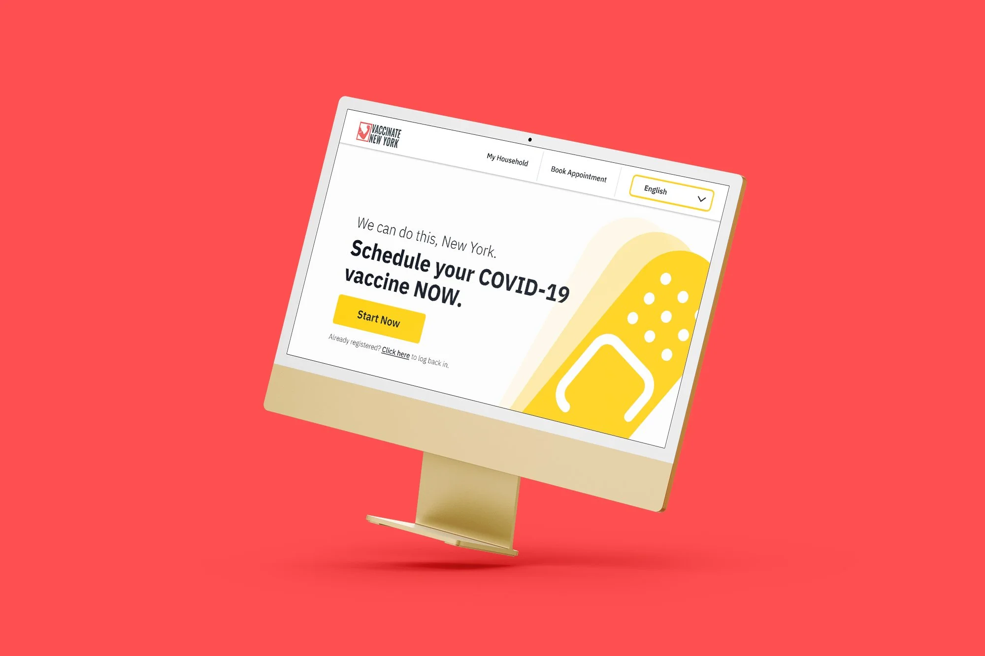
The problems with the current site for older users start with modern jargon and inconsistent branding even before exploring the UI itself. The current Health Department landing page refers to the portal as the “AM I ELIGIBLE app.” Not only was repeatedly referring to the linked website as an “app” confusing even for an internet-literate user like me (my first instinct was to search for it on the iOS App Store), but the “AM I ELIGIBLE” name makes it clear that the site’s primary function is as a gatekeeper for vaccine eligibility (even though most users who make it to this point would likely already know their eligibility status) rather than placing emphasis on the tool as the primary registration method. Using the generic “New York State” emblem on the mostly-blank header instead of the “Vaccinate New York” branding used for the state’s tie-in public awareness campaign leads users to wonder if they even navigated to the correct site (the URL for which is too lengthy, complex, and unmemorable for anyone, let alone an 85-year-old, to remember — little wonder they don’t list it on the billboards and commercials).
Landing Page
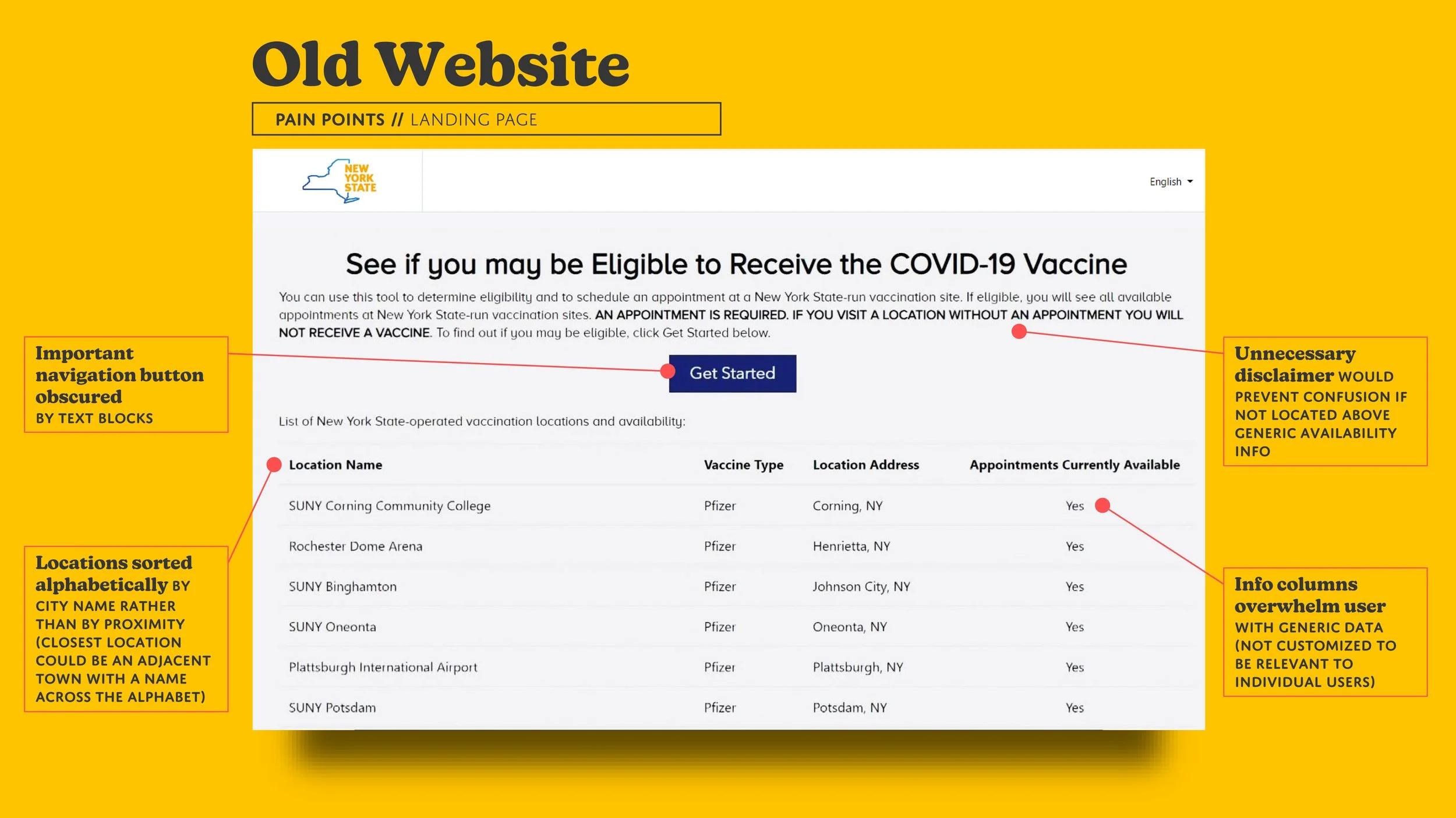
A binary “yes/no” field for “Appointments Currently Available” is practically useless. Not only is the user forced to visually scan the location names to recognize a provider with open appointments close to them (alphabetical sorting by city name does not help with proximity), but you have no way of knowing when those appointments are or how many are available.
Instead of cluttering screen space with fine-print disclaimers telling people they need an appointment before visiting these providers (warnings which wouldn’t be necessary if the availability info were simply limited to a future step), this landing page could instead feature a COVID-19 vaccine FAQ.
Eligibility Verification
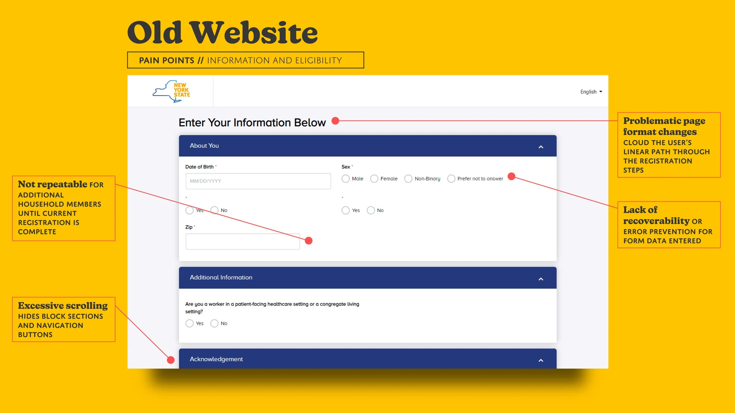
When we reach the form that checks vaccine eligibility, we start to see why the branding of this portal put so much emphasis on the gatekeeping aspect of registration — it forces you to complete every field from scratch every time you want to check for open appointments. This doesn’t just prevent the user from returning to a previous session if interrupted; it also forces a complete restart of the process for any additional household members they may be responsible for registering. Despite resembling a typical account sign up page, this form does not actually store any inputs to build up a virtual profile for each user. This page treats you like Bill Murray in Groundhog Day; “Not eligible today? Sorry. Come back tomorrow so you can start over and I can treat you like a total stranger again.”
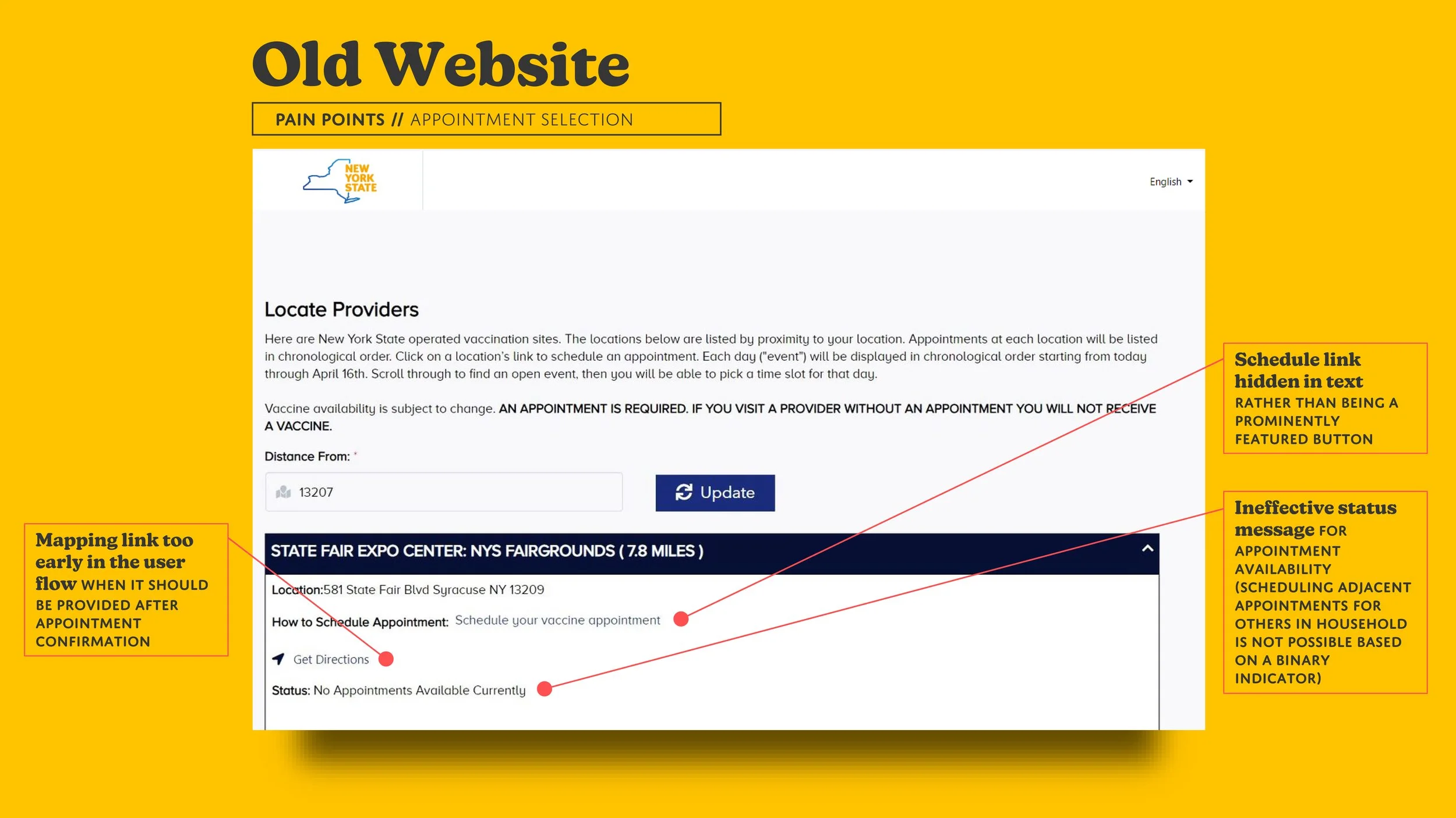
Appointment Selection
Finally, we arrive at the main event: selecting a preferred time and location. While this step is where the ageing user will require maximum intelligibility and flexibility, it currently has poor visual hierarchy and a single, rigid workflow. When designing for the older users, scrolling should be kept to a minimum and buttons and links should be clearly identifiable. This page did not get that memo. The link for actually viewing the calendar of available appointment slots at a location is hidden in body text when it should really be a prominent button beside each location name. The useless binary appointment availability indicator from the landing page once again rears its ugly head, sitting just below the premature mapping directions link (which offers to take you to a vaccine location prior to even registering for an appointment there).
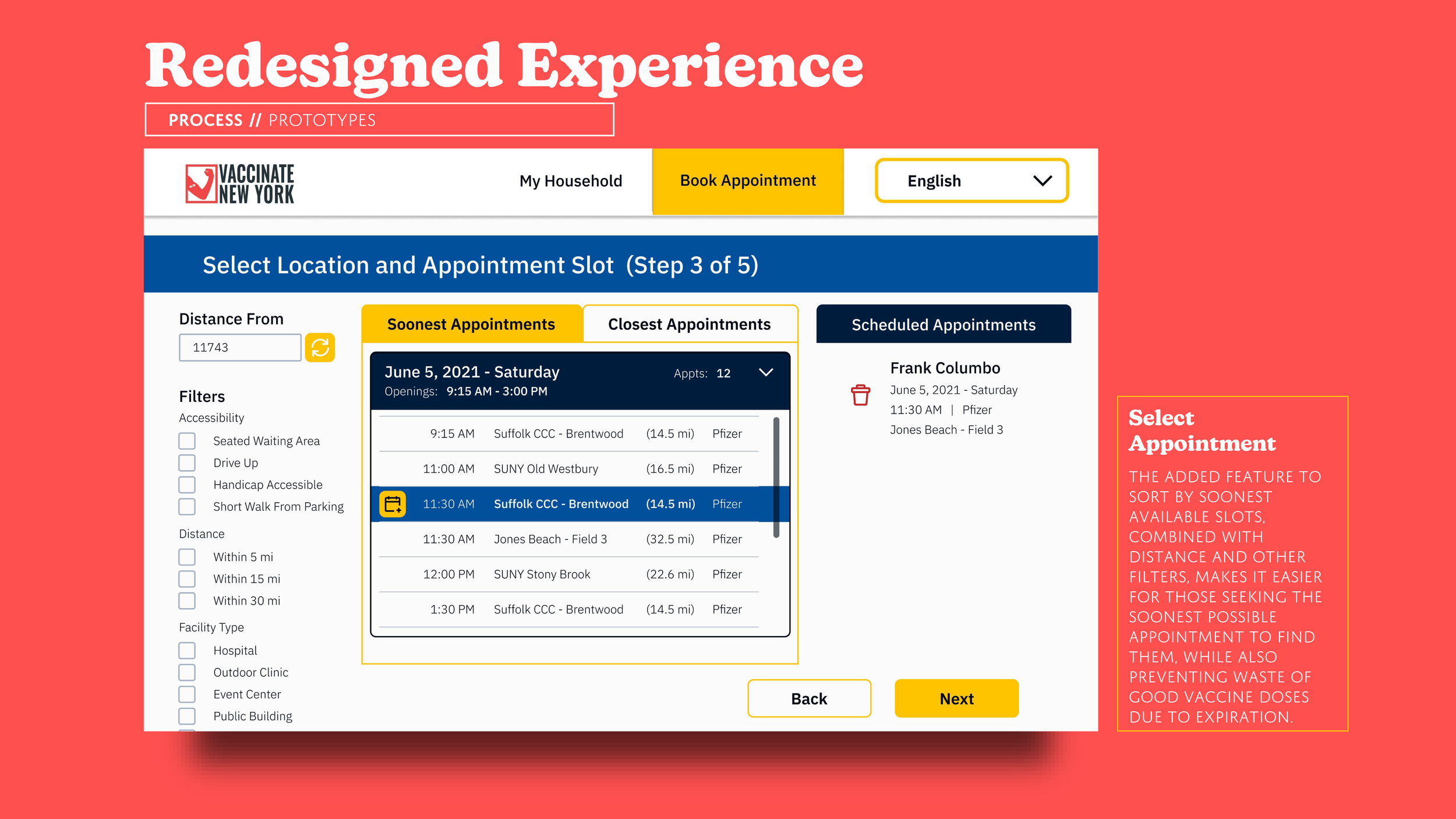
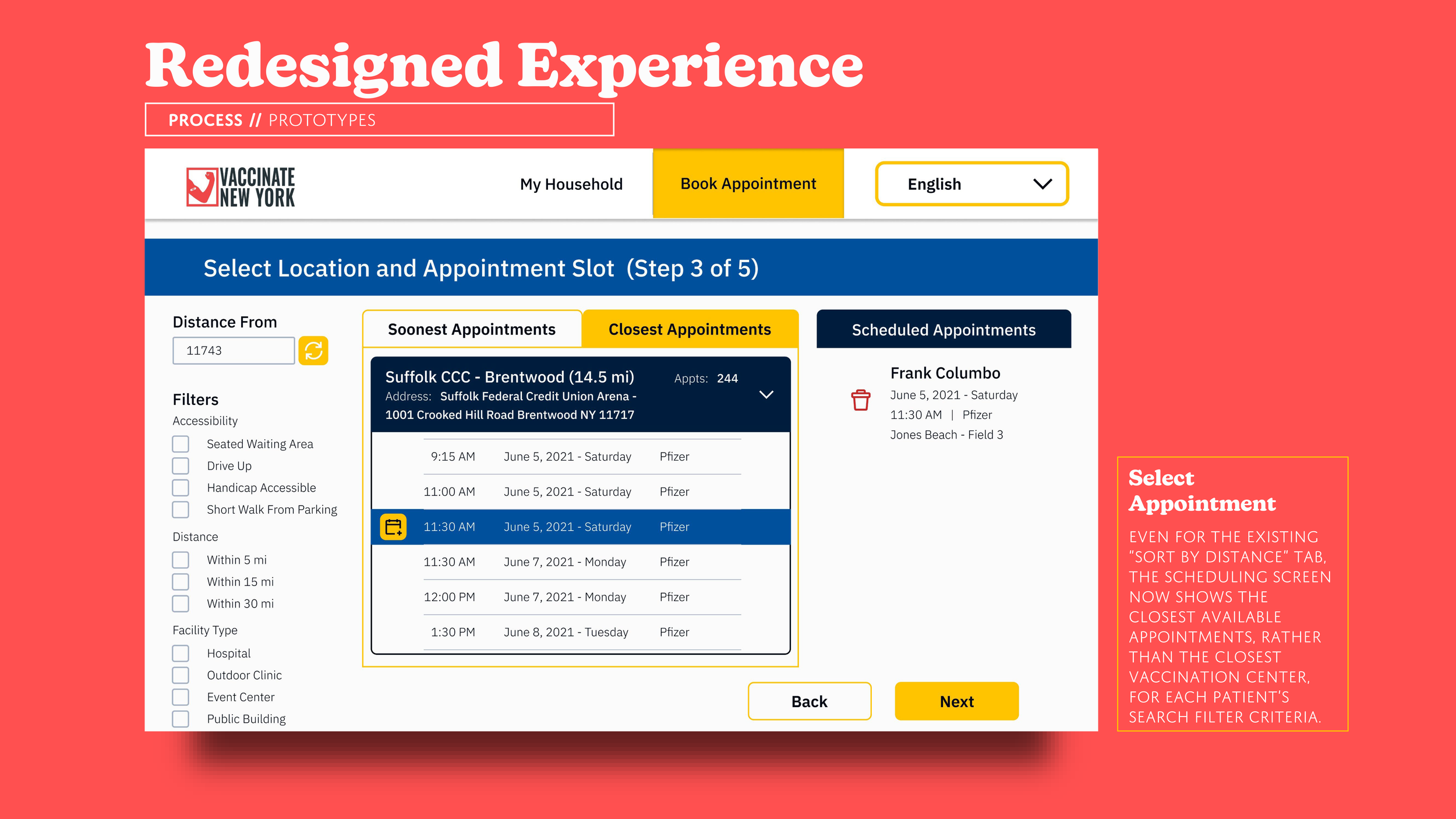
The site currently filters the closest providers to a given ZIP code, but, for the most vulnerable among us, sometimes the closest site is not the ideal one. It might not have any appointments, they might not be available for the slots that are open, or the location might not be a setting they are comfortable with (e.g., visiting a hospital is extremely risky for the elderly or immunocompromised). We’ll have to update the sequence of this page to reflect these alternate priorities that could supersede distance.
Confirmation Screen
While there is a confirmation screen, its primary purpose here is to tell you that your appointment slot was taken by someone else while you filled out the registration info. There is currently no timer or queueing system to ensure your selected appointment remains in your “cart” while you complete the registration, which means that if the page crashes or your elderly user accidentally closes the page, it’s back to Appointment Selection for you. If you do manage to hold onto your time slot, the only option for receiving reminder alerts is email, so perhaps automated phone calls or even texts would offer more flexibility for those older people who don’t regularly check their email inbox.
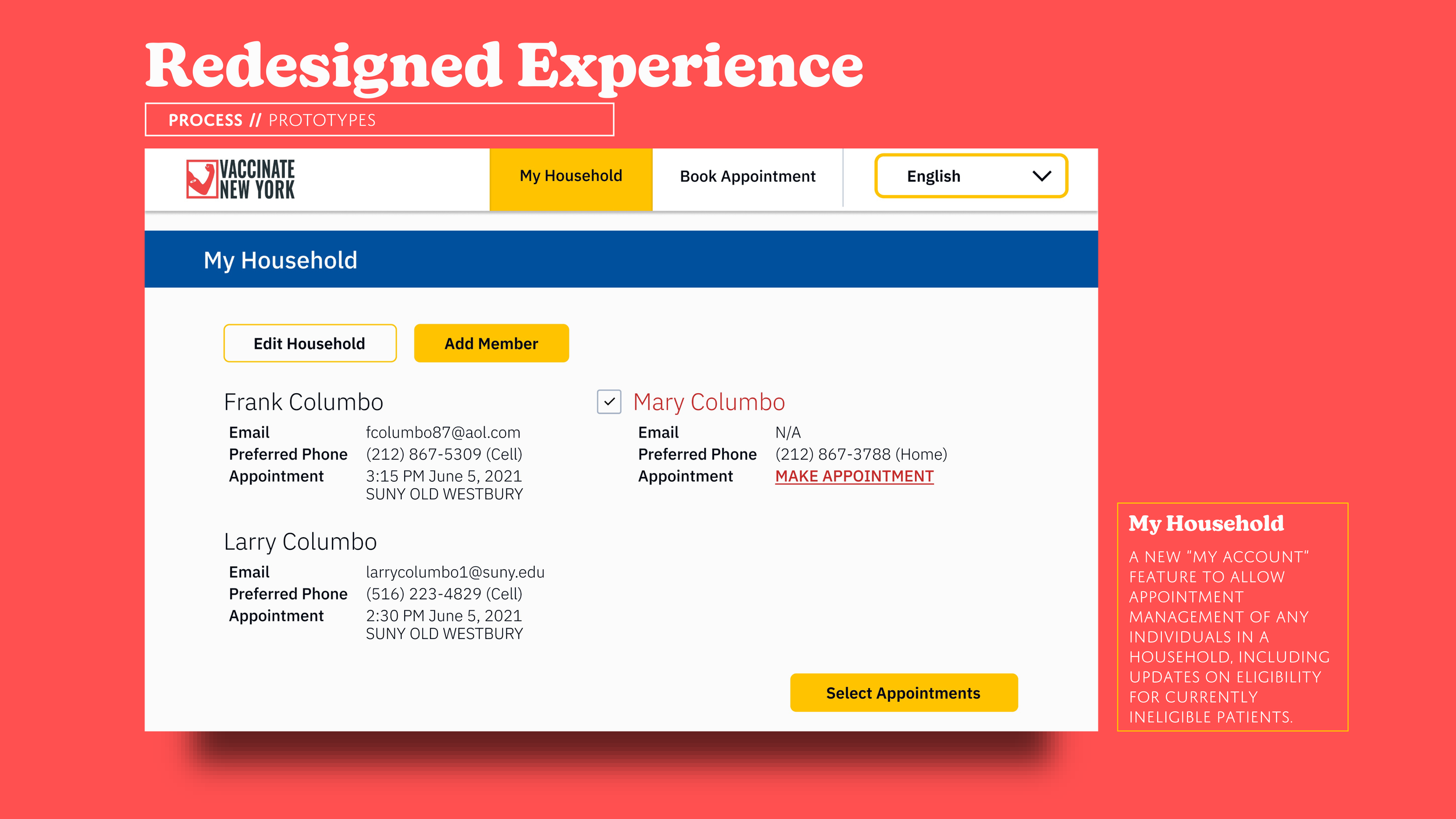
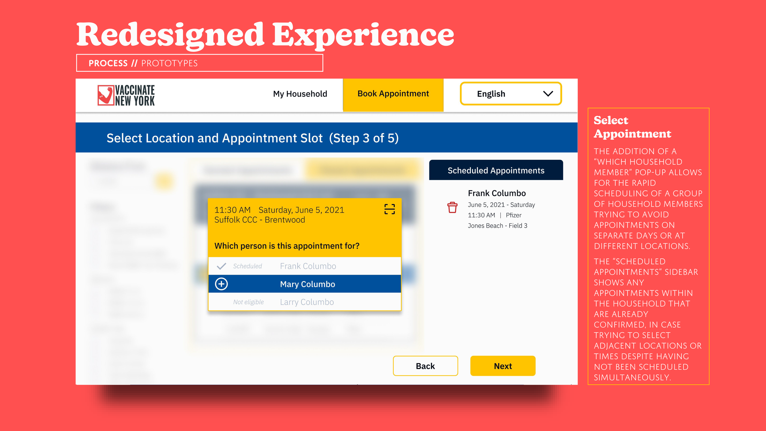
Now our protagonist has registered themselves, but what about their spouse? What about a family trying to register several household members at adjacent times to minimize the number of trips? With the current sequence, users are simply bounced all the way back to the landing page, so perhaps our “profile” idea can be expanded to managing eligibility and registration for other household members as well.

Process
Besides highlighting the UI issues for ageing users, walking through the user pain points revealed that much of the existing website’s flow issues can be attributed to the current rigid, unrepeatable structure that places emphasis on one-off eligibility checks rather than building up profiles for several individuals.

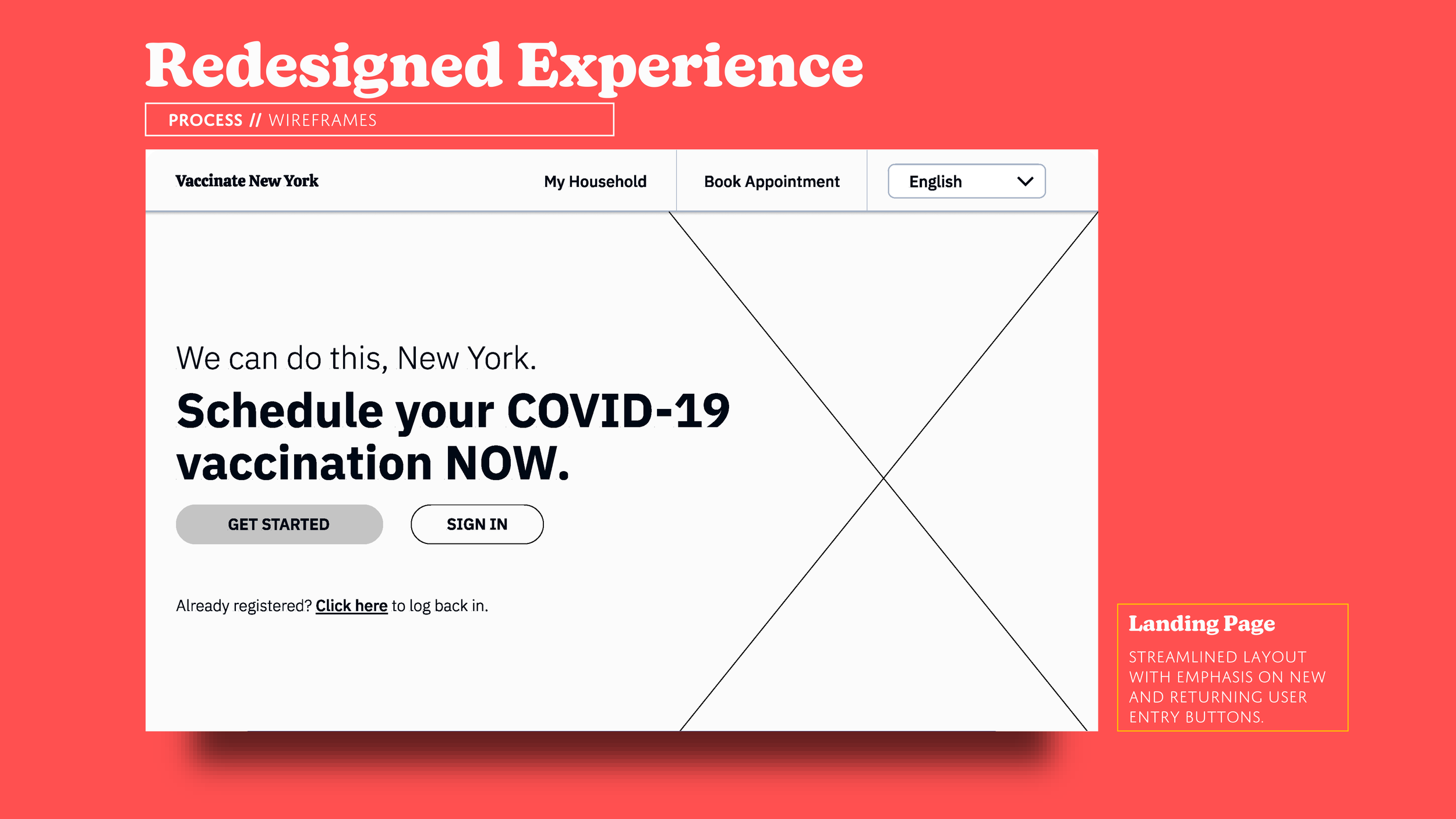
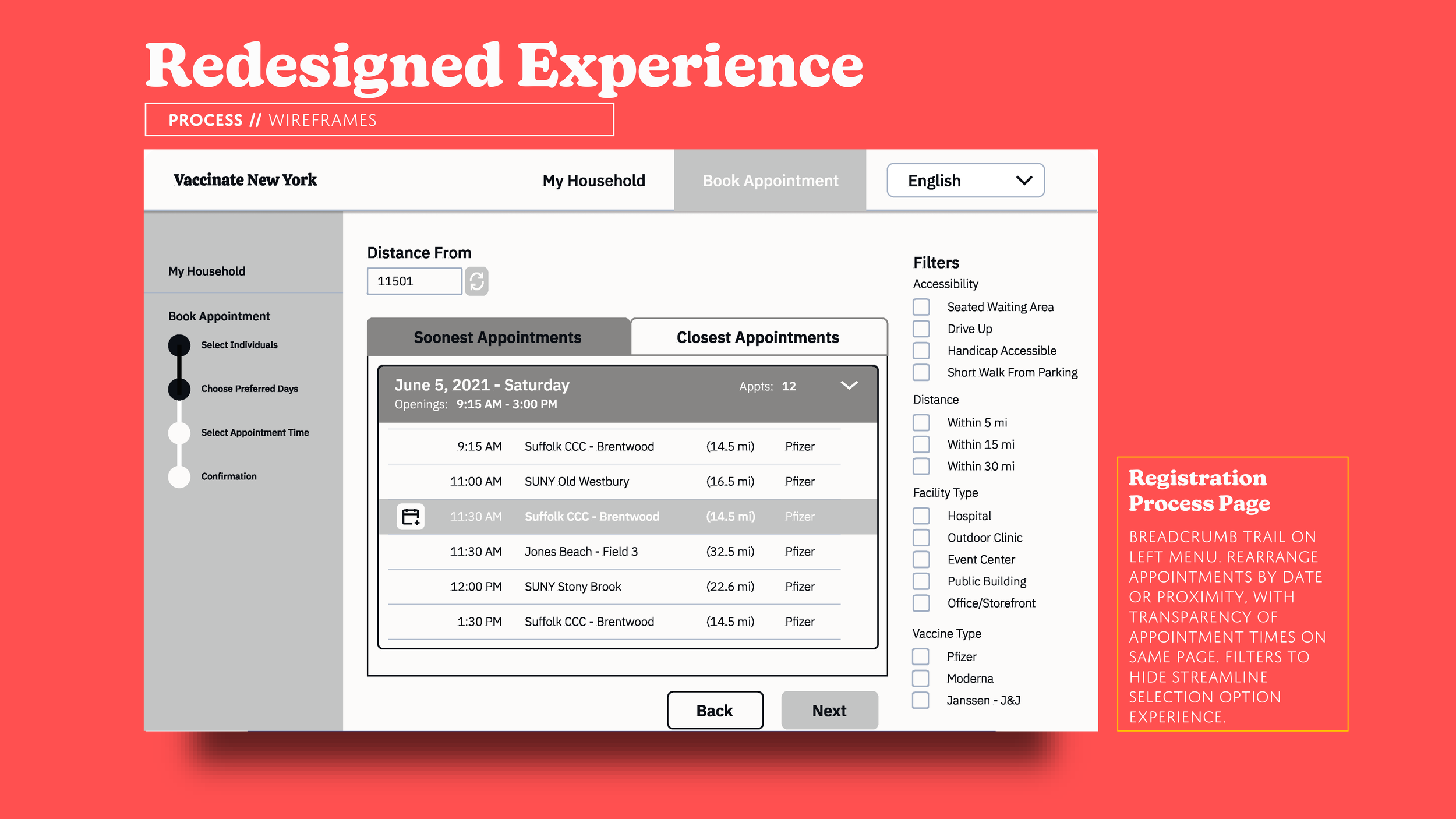
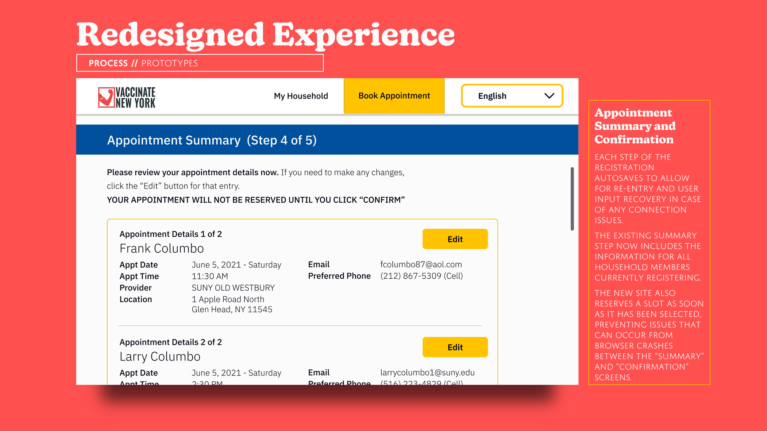
The new user flow would instead be based around a central hub called “My Household,” allowing a household leader to manage vaccine eligibility and appointment registration for any number of dependents without any one branch of user flow straying too far from this new home base. From “My Household,” users can register additional household members, select appointments for one or multiple individuals, or modify existing reservations. Not only will this create more intuitive user paths, but it also adds the most important UX element of all when accommodating older users; it is forgiving. The process now does not need to be completed in one sitting, queueing will prevent wasted time and effort during high traffic periods, and registrations can be easily updated as plans change during these “unprecedented times.”
Wireframes
One of the issues with the existing UI was its lack of transparency. With no information regarding a provider’s setup, handicap accessibility, or even the exact number of available appointments, the website almost feels adversarial, as if it would prefer you didn’t successfully snag one of the open time slots. No part of the registration process is designed to put the user at ease that they will be able to select the best appointment time and location for them. The initial wireframe sketches flip the framing of the registration page from the bottom line of a vaccine provider to the perspective of a vaccine recipient filtering through the factors most important to them.
UI Design
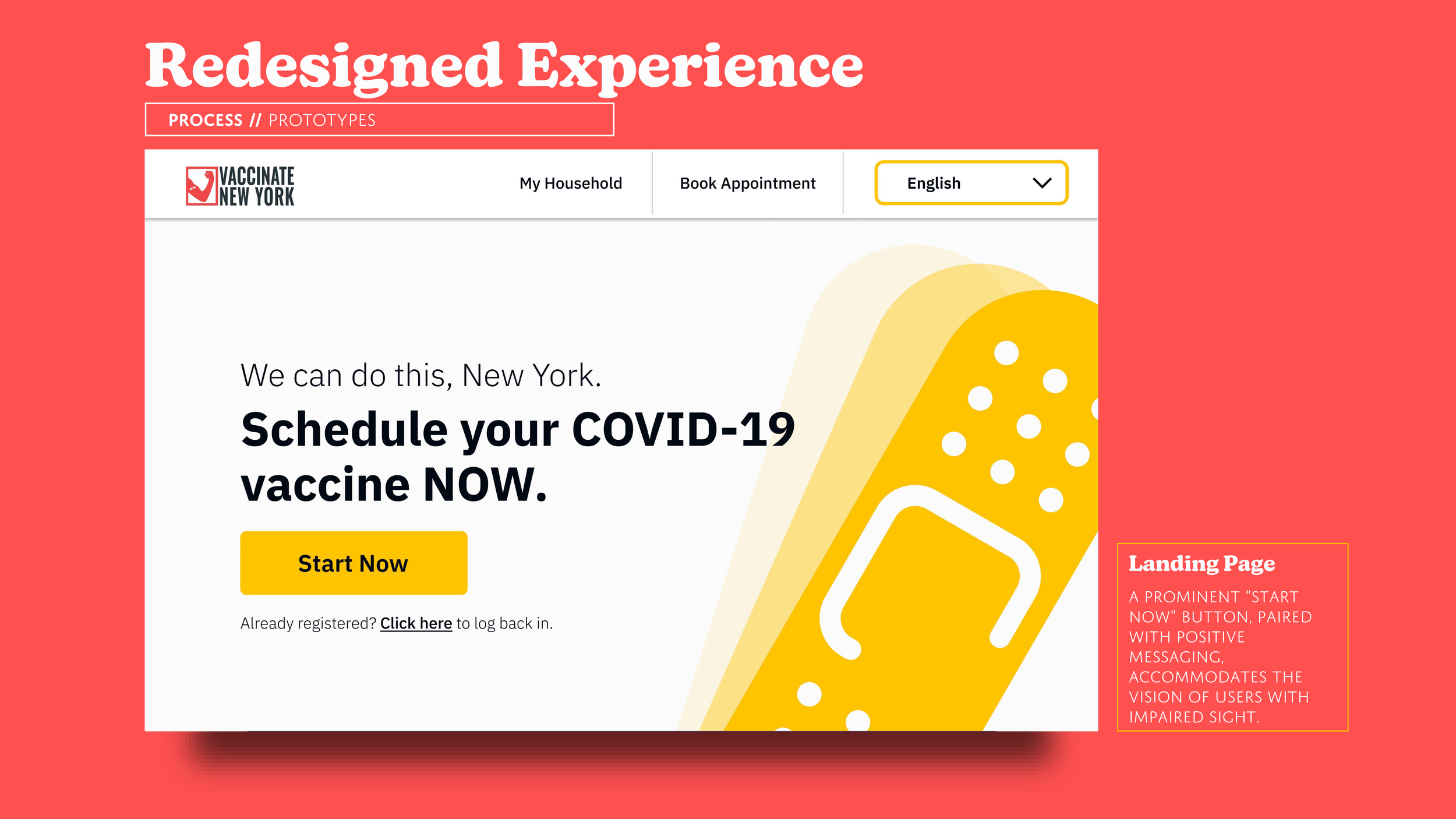
Final Model
The final result of this redesign exercise is a totally restructured registration portal that transformed a single, rigid user flow into a dynamic, intuitive, and (most importantly) accessible experience that introduced flexibility for error prevention and versatility to manage the registrations of an entire household, rather than one individual.

Reflection
Some Words on Accessible Design
While the review of pain points in the existing NYS vaccination portal was blunt, it does highlight just how essential the consideration of user personas is in development of a public-facing site, especially one so necessary for every person to be able to access. Though this case study really centered around one persona (an ageing user), I learned how important it is to not only consider the common user perspectives (as the existing Health Department website probably did), but also the perspectives of individuals who require additional accommodation. As I was reminded during this redesign project, a small amount of effort on the designer’s part to make a design element accessible can make a whole world of a difference to someone who needs it.
A Designer’s Work Is Never Done
While definitely an improvement, there are always opportunities for further development of this site in the future. The appointment selection filters, while useful, require some simplification (they effectively emulate a workflow younger users will recognize from online shopping sites, but they might be more accessible to older individuals if presented differently). Addition of a breadcrumb trail to the site’s subheader would also benefit the navigation by adding a visual progress meter to replace the written “Step X of 5.”