2022 // Case Study
The Walt Disney Studios & Apple Corps Ltd.
Miniseries 360 Identity Package Rework
Logo Design
Graphic Design
Packaging Design
Animation
-
Design a holistic campaign identity and strategy that aligns the marketing for Peter Jackson’s documentary miniseries, which reframes the narrative surrounding The Beatles’ impending breakup in 1969, across digital, physical, and social platforms.
-
Create a fresh logo, color palette, and visual language that looks “Beatle-y” enough to fit in with the Beatles visual ecosystem and be recognized by casual viewers and diehard Beatles fans alike.
Design distinct but aligned visual experiences across promotional marketing, Disney+ branding, and home entertainment release packaging.
Ensure use of the Beatles “drop T” wordmark (requested by Apple Corps Ltd).
-
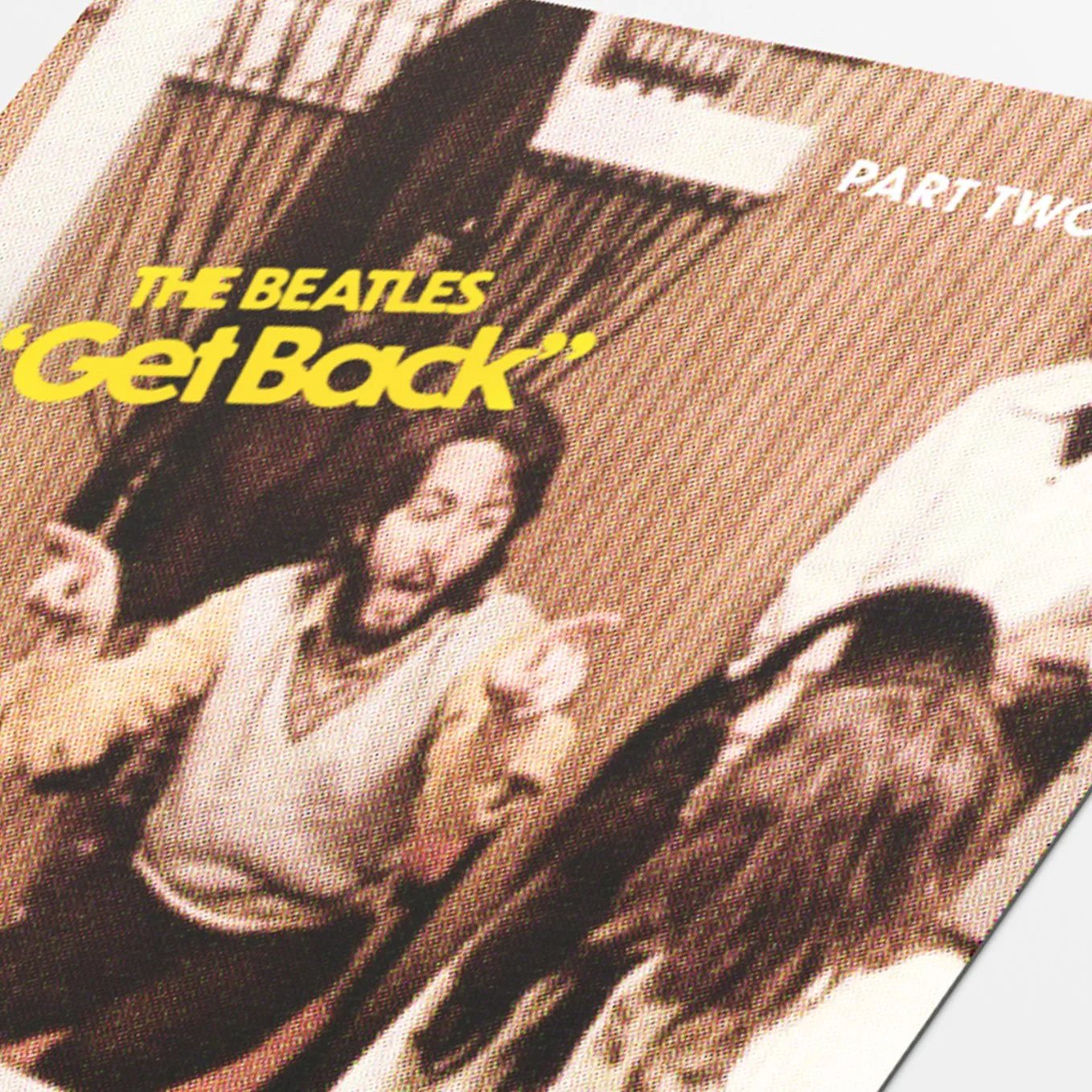
Warm, bold typography (reminiscent of late Beatles album art) takes viewers back to 1970 and the dramatic story they think they already know, but with an ultimately more optimistic tone.
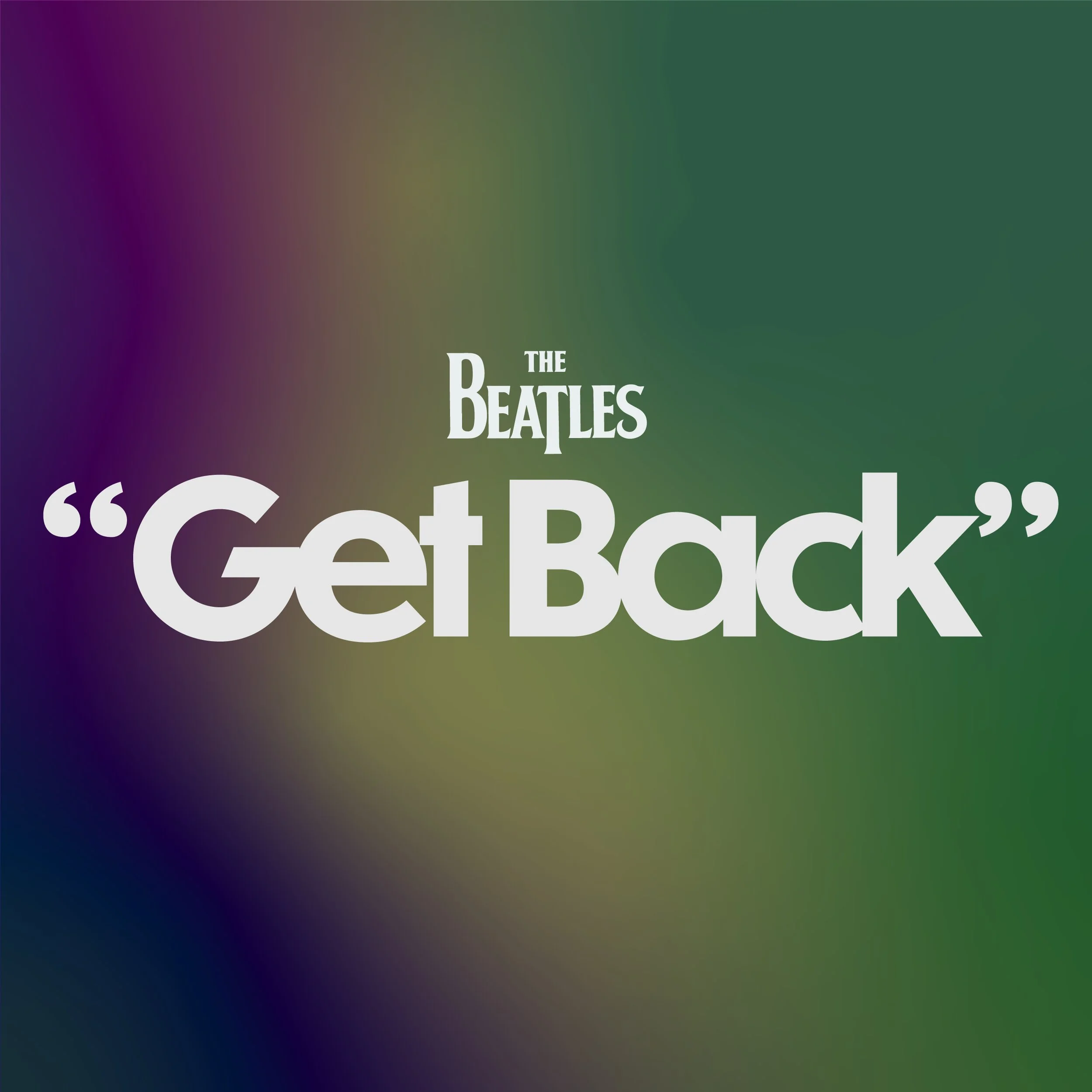
The light-on-black palette with multicolor glow pushing in from the edges aligns the documentary’s visual identity with the visual styles of the adjacently-released Let It Be album remix and photo book.
Logo.
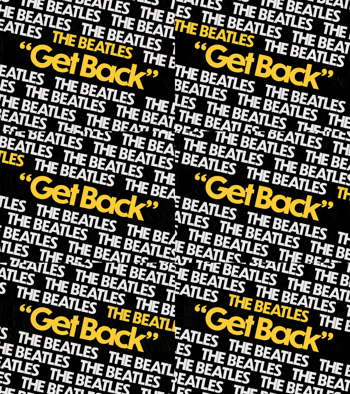
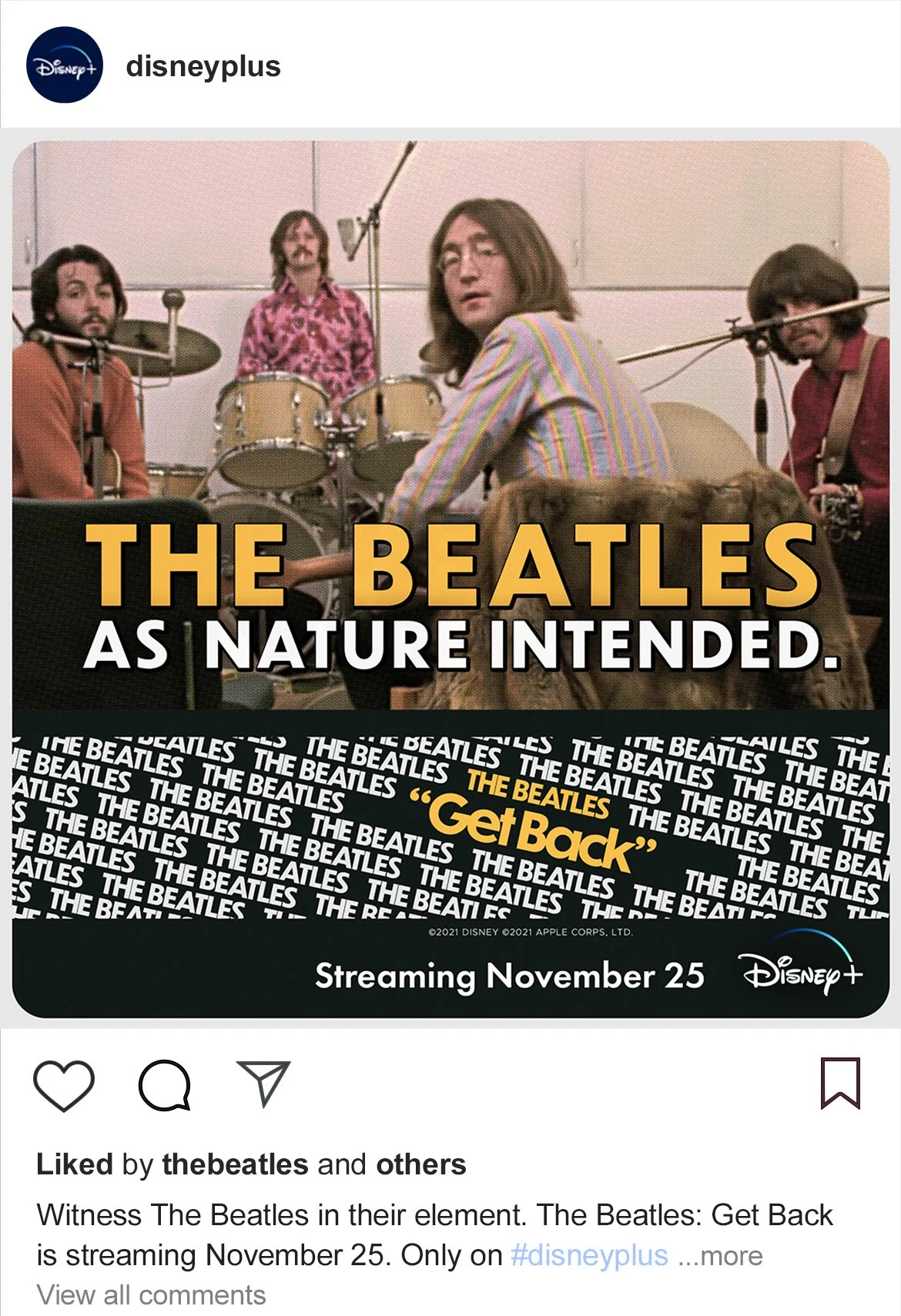
Promotional Materials.
Plenty of design elements to go around.
Rather than using hand-me-down graphic elements from the Let It Be album rerelease and Get Back photo book, the “Get Back” identity system instead takes inspiration from the source material.
This “aurora” design on the Disney+ poster, like the series itself, stands on the shoulder of the original Let It Be movie but sheds a new, positive light on it.
This Facebook banner image resembles the horizontal layout of midcentury lobby cards you would have found in 1970s cinemas. You would not, however, have found them advertising the complete Apple Corps rooftop concert. Disney+ has a lock on that.
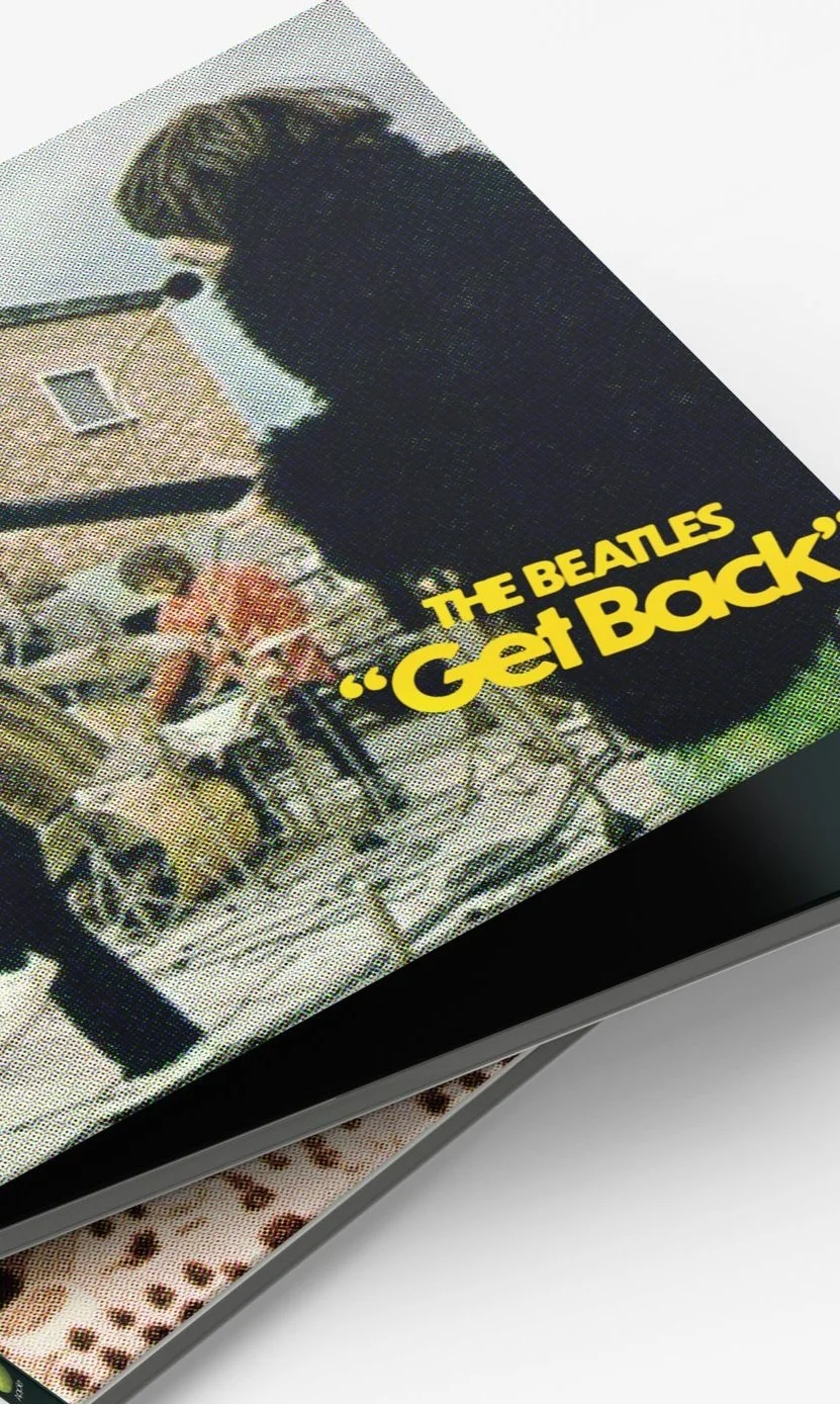
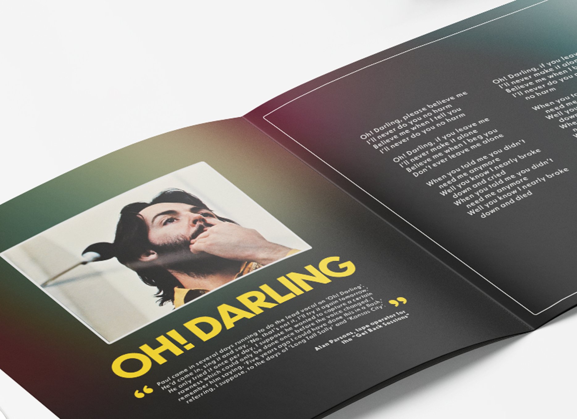
Blu-Ray Collector’s Edition Release.
For the fans whose first 8-hour watch party wasn’t enough.
When your whole documentary is one big bonus feature, you have to think outside the disc.


